The University of Southern California has a variety of marks and logos that are an integral part of its identity. In this section we introduce you to these elements; their versions, color variations, clear space, minimum size requirements and a guide to their proper usage.
The marks and logotypes are available for download to USC faculty and staff (including student staff) with a usc.edu email account.
For information regarding Academic logotypes and Athletic or Spirit marks please review here:
The Marks
The USC Graphic Identity Program is designed to convey the unique qualities of the University of Southern California. Its foundational elements are the marks, composed of: the Seal, the Shield, the Monogram and the Wordmark.
The Seal
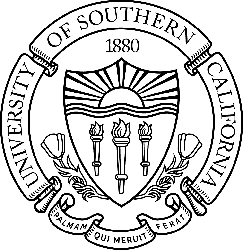
The university seal is the most formal mark of the University of Southern California and is used only for formal occasions and presidential communications. It is used as a stand-alone element or as a lockup with the primary wordmark or monogram. The seal can only be obtained through special request.
For files, please contact identity@usc.edu
The Shield
The university shield is the primary element of the University of Southern California and is the mark most commonly used to express the brand. The shield can be found at the center of the Seal. It is used as a stand-alone element or as a lockup with the primary wordmark or monogram.

The Monogram
The university monogram is the “shorthand” identifier for USC. As an acronym, it is often used to identify the University of Southern California in a variety of applications. It is used as a stand-alone element or in a lockup with the primary and academic wordmarks.

The Wordmark
The primary wordmark is a unique typographic signature that displays the University of Southern California name in a flush-left configuration. It can stand alone or is used in a lockup with either the seal, shield or monogram to form the University’s brand logotypes. There are two versions of this logotype: one-line and two-line (shown).

Logotypes
The logotypes are different combinations of the marks and wordmarks that when put together form the backbone of the USC Graphic Identity Program known as logo lockups. These logo lockups are known as: The Primary Logotype, The Informal Logotype, The Primary Monogram, the Formal Logotype and the Formal Monogram. Logo lockups are also used to create the Academic logotypes.
Primary Logotype
The primary USC logotype is a lockup formed through the combination of the university shield, monogram and primary wordmark in a flush-left configuration. It is the primary identifying mark of the university and the most frequently used logotype.

Formal Logotype
The formal USC logotype is a lockup formed through the combination of the university shield, monogram and primary wordmark in a flush-left configuration and is the most formal expression of the USC identity. Documents, publications or merchandise items displaying the university seal imply official sanction by the university and can only be used upon special request.
For files please contact identity@usc.edu.

Informal Logotype
The informal USC logotype is a lockup formed through the combination of the monogram and primary wordmark in a flush-left configuration and is the most informal expression of the USC identity.

Primary Monogram
The primary monogram is a lockup formed through the combination of the shield and monogram. It is one of the primary expressions of the identity and can be used when space is limited or an abbreviated expression of the identity is appropriate.

Formal Monogram
The formal monogram is a lockup formed through the combination of the seal and monogram. It is the most formal expression of the USC Identity can be used when space is limited or a formal expression of the
identity is appropriate.
For files, please contact identity@usc.edu.

Clear Space
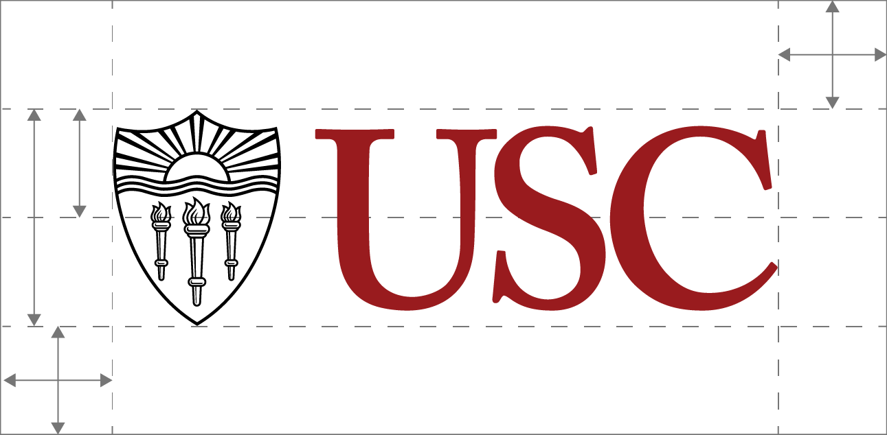
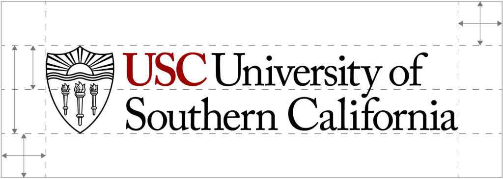
To ensure that the marks and logotypes are highly visible, clear space is created around them to keep them separate from their surroundings. Do not allow other graphic elements into this area of isolation. In addition, the elements of the USC Graphic Identity Program should not be placed over a photograph or patterned background if it reduces its legibility.
The area of isolation, or minimum required space, surrounding all logotypes should equal to half the height of the logotype or mark.
Regular-Use and Small-Use
Many of the logotypes and marks have regular-use and small-use versions. This is because the Seal and Shield have been drawn two different ways.
- Regular-use versions are drawn with more detail which will display better when used at a larger size.
- Small-use versions are drawn with less detail to reproduce better at small sizes.
Minimum sizes for each are shown below.
The Seal
Regular-Use
Small-Use
The Shield
Regular-Use

Small-Use

Minimum Size
The logotypes need to be legible and should not be reduced in size beyond the minimums shown below.
The Seal
Regular-Use
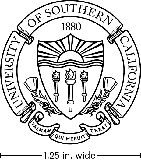
Small-Use
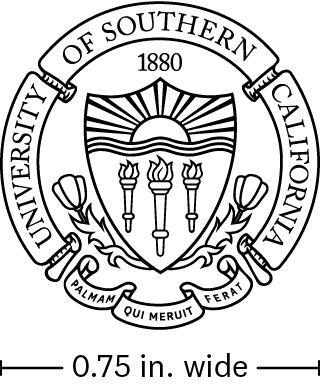
The Shield
Regular-Use
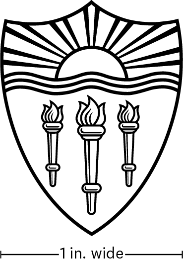
Small-Use
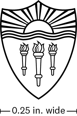
How to Request an Official USC Logotype
To create an official USC academic or administrative logotype or a subunit logotype, please complete and submit a USC University Communications Creative Project Request form. NOTE: If after reviewing the following text, your unit does not qualify for an official logotype please refer to our branded merchandise templates as a possible option. The templates offer an easy to use, unique and ownable option to brand your merchandise.
Please note the following:
- Official USC logotypes are reserved for academic schools, senior administrative units, joint enterprises and prominent campus entities (USC Bookstore, USC Fisher Gallery, USC Hotel)
- Subunit logotypes are for departments within academic and administrative units. Subunits also include centers, institutes, laboratories and programs. Subunits do not include undergraduate and graduate programs (e.g. MA, PhD, JD degrees)
- Unique logotypes are not allowed. Campus entities which include but are not limited to academic and administrative units, centers, institutes, laboratories and programs, are not allowed to create unique logotypes. If the entities meet the criteria outlined above, they may request an official USC logotype or subunit.
- Ampersands are not allowed for use in official USC logotypes or official subunit logotypes.
- Student organizations are allowed to create their own logotypes as long as they do not mimic official university logotypes and marks.
Download
The marks and logotypes are available for download to USC faculty and staff (including student staff) with a usc.edu email account. These assets are protected by university policy and trademark law, are not to be altered or changed, and their use is restricted to official university business in accordance with brand guidelines. If you have any questions, contact identity@usc.edu.
How to Download:
- Click on the link to download the logotype or mark.
- You will then be prompted to sign-in to continue to the USC Google Drive.
- Enter your USC email account (i.e.), @usc.edu.
- You will then be prompted to login with your USC NetID (username) and password on USC Shibboleth.
- Please note: Using your Gmail or other external email accounts, will not allow you to access the system to download files. You must have a usc.edu email account and use your USC NetID login to access the system.
If you are logged into your Gmail account, you will not be able to download a file. Please make sure you are logged into your usc.edu account.
Do Nots
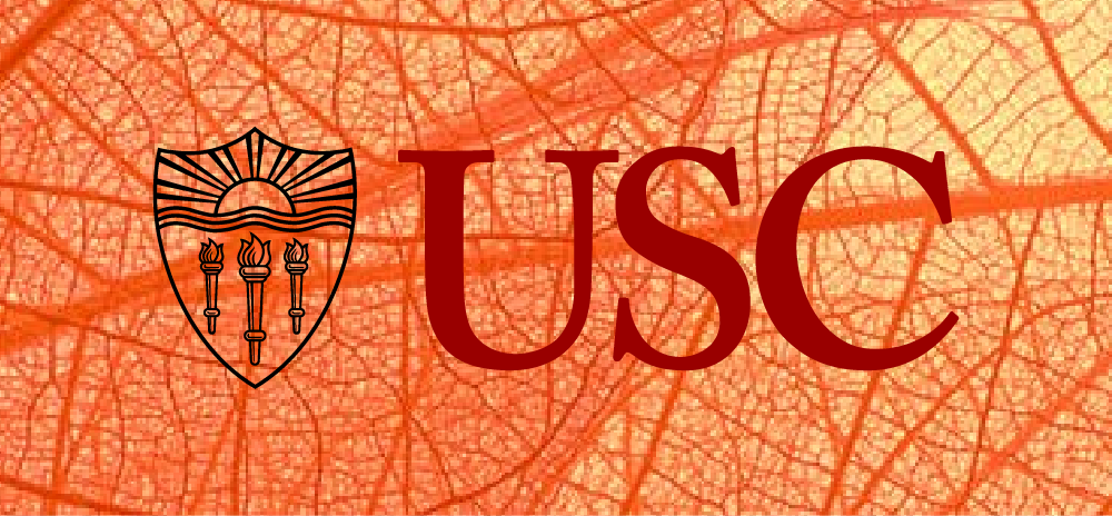
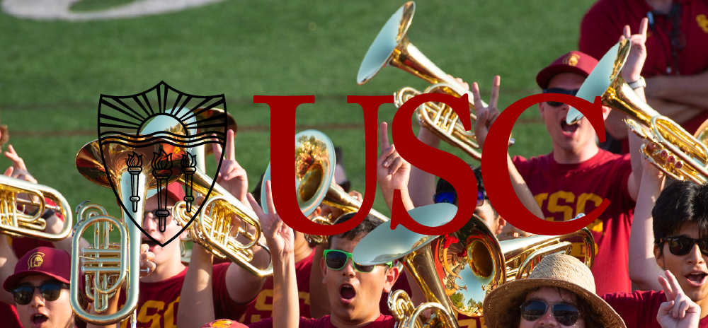
Marks and Logotypes should not be altered in any way or placed on busy backgrounds or colors that reduce legibility. If a mark or logotype is placed over a photograph or background texture it should not diminish its readability.
Color Combinations
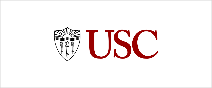
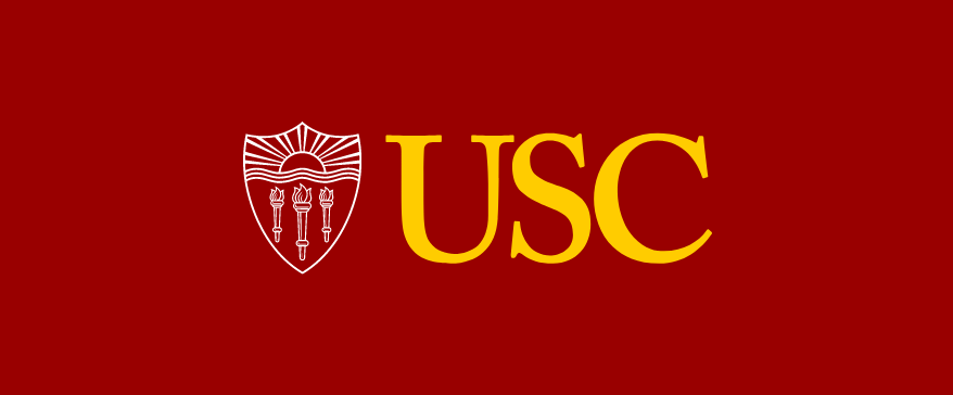
USC’s colors reflect our values and resonates with our audience, building trust and recognition. Adhering to our approved palette and color combinations ensures a uniform brand identity for USC and guarantees accessibility.
Approved Color Combinations


Unapproved Color Combinations
The unapproved USC color combinations do not comply with ADA standards, potentially hindering accessibility for individuals with visual impairments.


History
In 1994, Saul Bass, the venerated L.A.-based graphic designer, developed an identity that served as the institution’s primary graphic identity.
In 2006, Pentagram was tapped to develop a new identity for the university that addressed the new and growing naming of academic units under the USC umbrella. Overseen by Pentagram’s DJ Stout, the new identity gave the university’s academic units and various brands a simple, consistent system to follow. The elements were also redrawn to increase legibility on websites and mobile devices.
The marks below were used prior to the 1994 and 2006 updates and are no longer in formal use today.
