USC’s official colors are USC Cardinal and USC Gold. Each color is equal in importance in identifying the university. The official brand colors are a powerful and essential brand element that create a consistent identity across all communications and applications. They are not an arbitrary choice. Because these colors communicate identity they are protected by trademark law.
Usage
USC Cardinal and USC Gold use specific PMS, CMYK, RGB and HEX formulas to create consistent colors across all channels and media. Primary importance is also given to good contrast for legibility and accessibility. The following are important things to note when working with the university colors:
- For print projects: Use PMS or CMYK
- For digital and web projects: Use RGB and HEX
- Secondary and tertiary colors should not replace the two primary colors. Instead, they are meant to be used with the two primary colors, USC Cardinal and USC Gold.
- Tertiary colors should be restricted to use in graphic elements and accent colors, not type.
- Follow the guidelines and specifications in this section to correctly apply this important
brand element. - Work with USC Trademarks and Licensing to use an approved and licensed USC vendor to ensure you are following brand guidelines.
Special note regarding PMS (Pantone Matching System)
Our two primary brand colors, Cardinal and Gold, are matched to the PMS system. However, PMS colors are now no longer available through Adobe Apps. Please contact us for a workaround for this issue at identity@usc.edu.
Matching to the brand colors on uncoated paper
If you are trying to match our brand colors PMS 201C and PMS 123C on uncoated paper you will note that we always match to the coated (C) version of the Pantone color. That means that all printers MUST match to the coated Pantone chip of that color. Approved printers know this and should not make the mistake of using the uncoated PMS chip to match.
If you do not match your color to the coated chip, you will get your Gold will look orange and your Cardinal will look too dark.
The designer should create the file using the PMS C (coated) color. If the designer is printing in CMYK and not using Pantone colors, they must use the approved CMYK color combinations for the brand colors. When the designer goes to the printer, they should take the Pantone COATED chips with them to match to the coated color.
The Color Palette
The primary colors, USC Cardinal and USC Gold, are supplemented by a secondary and tertiary color palette. The secondary palette provides additional flexibility while the tertiary palette should be restricted in use to graphic elements or accent colors. Tertiary colors should not be used for text.
Primary Brand Colors
The official colors, USC Cardinal and USC Gold, are of equal importance as a brand element.
USC Cardinal
USC Gold
Secondary Colors
Black and white have an important place in USC branding. Black has long been used in tandem with USC Cardinal and USC Gold but should not be used as a replacement for either color. The use of white to create ‘white space’ is meant to create an environment that is more open and accessible. To ensure that tints of black meet ADA compliance guidelines we use only two tints; 30k for use on black and 70k for use on white.
Black (100K)
White
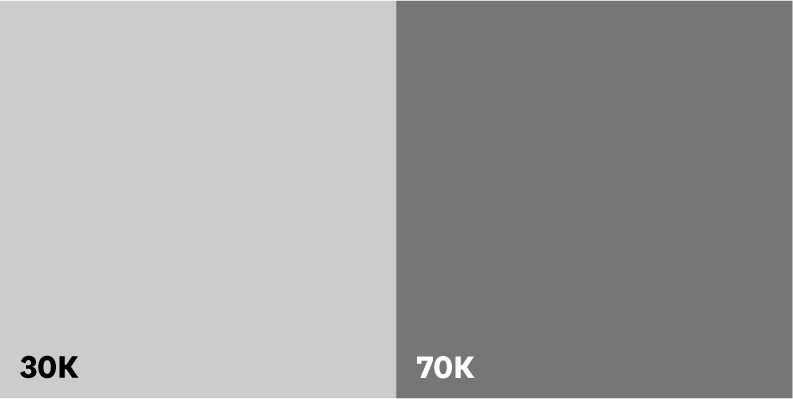
Gray (30K)
Gray (70K)

Rich Black (40C, 100K)
If you are printing a large panel of black and want to create a richer color, add 40C to the black.
Tertiary Colors
Tertiary colors add flexibility and are meant to be used with the two primary colors, USC Cardinal and USC Gold. Tertiary colors should be restricted to use in graphic elements and accent colors.
Tints and Shades
Secondary colors add flexibility and are meant to be used with the two primary colors, USC Cardinal and USC Gold. They should not replace the two primary colors.
Tints
PMS 123 C
(USC Gold)
75%
50%
25%
PMS 201 C
(USC Cardinal)
Tints for PMS 201 C (USC Cardinal) are not permitted.
Shades
PMS 201 C
(USC Cardinal)
+10% K
+20% K
+30% K
PMS 123 C
(USC Gold)
Shades for PMS 123 C (USC Gold) are not permitted.
Gradients
Gradients demonstrate the gradual blending from one color to another and can be used to add depth to backgrounds and graphic elements like icons. When placing type over gradients, make sure the contrast ratio between the two meets accessibility standards.
The following are two examples to show the type of gradients you can create.


Color Combinations
USC’s colors reflect our values and resonate with our audience, building trust and recognition. Adhering to our approved palette and color combinations ensures a uniform brand identity for USC and guarantees accessibility.
- Approved colors for the Marks and Wordmarks are Cardinal, Gold, Light Gray (30K) or Dark Gray (70K).
- When the Shield is combined with either the Monogram or Wordmark, the Shield can only be white or black.
- When combined, the Shield cannot be the same color as the Monogram or Wordmark, ie., all black or all white.
- For Academic logotype color combinations please click here.
Approved Color Combinations


Unapproved Color Combinations
Color combinations for the Primary Monogram and Primary Wordmark are unapproved under the following circumstances:
- When the Shield is the same color as either the Monogram (Primary Monogram) or Wordmark (Primary Wordmark), ie., all white, all black, all cardinal, etc.*
- When the color combination is not ADA compliant.
*Exceptions are made for one-color print jobs for merchandise.

Cannot use gold over white background.

Cannot use black over cardinal background.

Cannot use white over gold background.

Cannot use cardinal over black background.

Cannot use white over gray 30K background.

Cannot use cardinal over gray 70K background.

Cannot use black over cardinal background.

Cannot use gray 70K over black background.
Accessibility
Color contrast is very important to legibility. To meet current accessibility standards, use only approved color combinations.
For websites and other online uses, WebAim Color Contrast Checker is a good tool to measure contrast. For printed materials, the standards are not as easy to measure. Be sure to take special care with reverse type and type overlays.
Web Content Accessibility Guidelines (WCAG) is the benchmark for accessibility. It was developed by the World Wide Web Consortium (W3C) whose goal is to provide a single shared standard for web content accessibility.
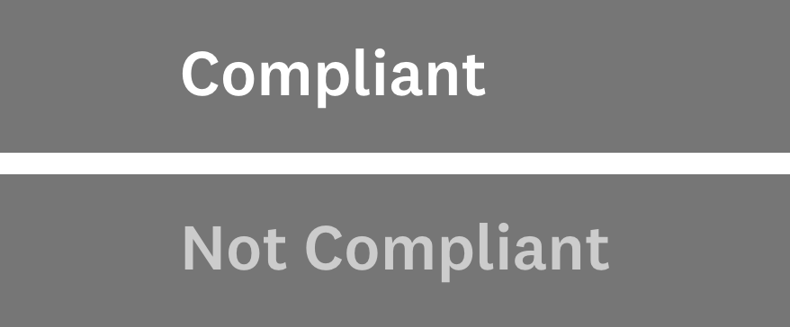
The following are examples of compliant and non-compliant color contrast.
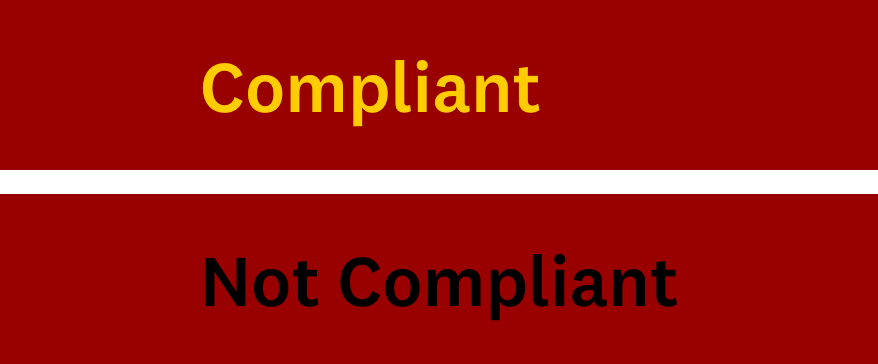
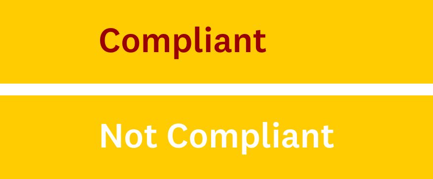
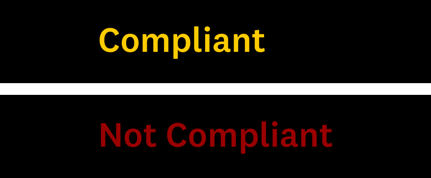
To meet current accessibility standards, use only approved color combinations. For websites and other online uses, WebAim Color Contrast Checker is a good tool to measure contrast. For printed materials, the standards are not as easy to measure. Be sure to take special care with reverse type and type overlays.